We made the unicorn our footballing identity

The first time I pulled on our Unicorns kit, I felt an immense sense of pride and love.
“We made this!” I thought to myself as I looked in the mirror. There I was, going full kit wanker, boots and all, in my living room. I don’t think I took my kit off for the rest of the day.
A great football kit signals identity, belonging and seriousness of intent. It allows you to celebrate who you are as a club, pays respect to your team members and fans, and signals to your opponents that you mean business. A big part of amateur football is respecting the dreams you had as little kids to be superstars, and your very own shirt — with your very own crest — is the quintessential way of paying respect to your child self.
If the feeling I had pulling that first Unicorns shirt over my head was intense, it was nothing compared with unboxing the entire batch and handing them out to the rest of the players. Faces beaming, sharing goofy looks with one another, as if to say: what do you reckon?
That was, in many ways, the moment we became a team.
The shaggy black unicorn stallion
The first Unicorns kit was a collaborative and uplifting process. Not only were we creating new kits, we were also establishing our new colours: pink (for diversity) and black (for Berlin), our new name, and our new crest — a wild and shaggy black unicorn stallion, framed by a 70s Italian-style shield.
Seeing all of those elements come together in a single shirt was a galvanising moment, and paid respect to all the time and effort the players, our families and friends were putting into playing, supporting and building a community together. We sold around 100 shirts and donated the money to the LSVD Association for Queer Diversity in Berlin, a cause that felt right for a club built on inclusivity.


Did our kits have an impact on the performance of the team? You better believe it. From tenth the year before, we surged up the table of our Freizeitliga division, going unbeaten for nine games and earning promotion after pulling those shirts on for the first time.
We were the Unicorns, finally.
We knew it, our opponents knew it, our fans knew it. Now we were even playing like it.
The following year our momentum earned us a new sponsor, the legendary Krass Böser Wolff bar in Friedrichshain. Their name was added to the shirts, and a white away strip joined the mix. To have a sponsor felt amazing, and seeing the bartenders at KBW wearing those shirts while serving trays of 20+ post-game Mexicaners for the community was a surreal feeling.
A nod to Boca Juniors
Our second kit went far beyond a simple Puma template. Andy, one of the club captains and our resident authority on fashion and good taste, wanted the challenge of making something completely from scratch. He mocked up some ideas, and what followed—arguing over details, debating options, eventually voting on a direction—turned out to be as much a team-building exercise as any training session. We worked with EDO Goods in Berlin to get the shirts sustainably made in Portugal.
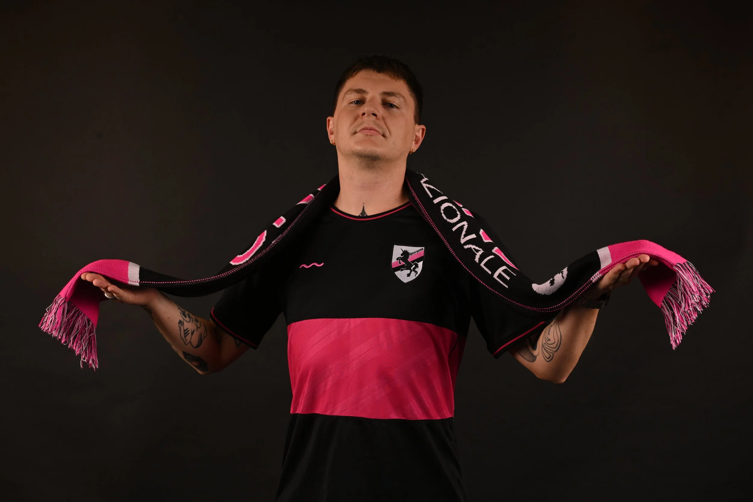
The chosen design featured a horizontal stripe in the style of Boca Juniors. The combination of a traditional cut with our unique colours created something that felt completely new, yet as if it had always existed. The fabric featured a pattern that matched the diagonals in our crest, for added class.
Everybody loved those shirts. They were worn on the pitch, at music festivals, in clubs and pretty much any time the sun came out over Berlin.

We wore them for three years, and gave them the send-off they deserved by winning the Freizeitliga in our final season in them. Many of us had never won anything in our lives. That shirt will live long in the memory; I can still remember the smell of my champagne-soaked shirt when I put it in the wash after our raucous celebrations.
Unicorns are real
This year we created our third kit, alongside a redesign of the club crest and a new brand message: Unicorns Are Real. A new partnership with RAVAL helped shape the design, and a sponsorship with HOME, the bar that has become our local just fifty metres from the pitch, gives the shirts a throwback feel, evoking the era of JVC, Sharp and Mars kits.
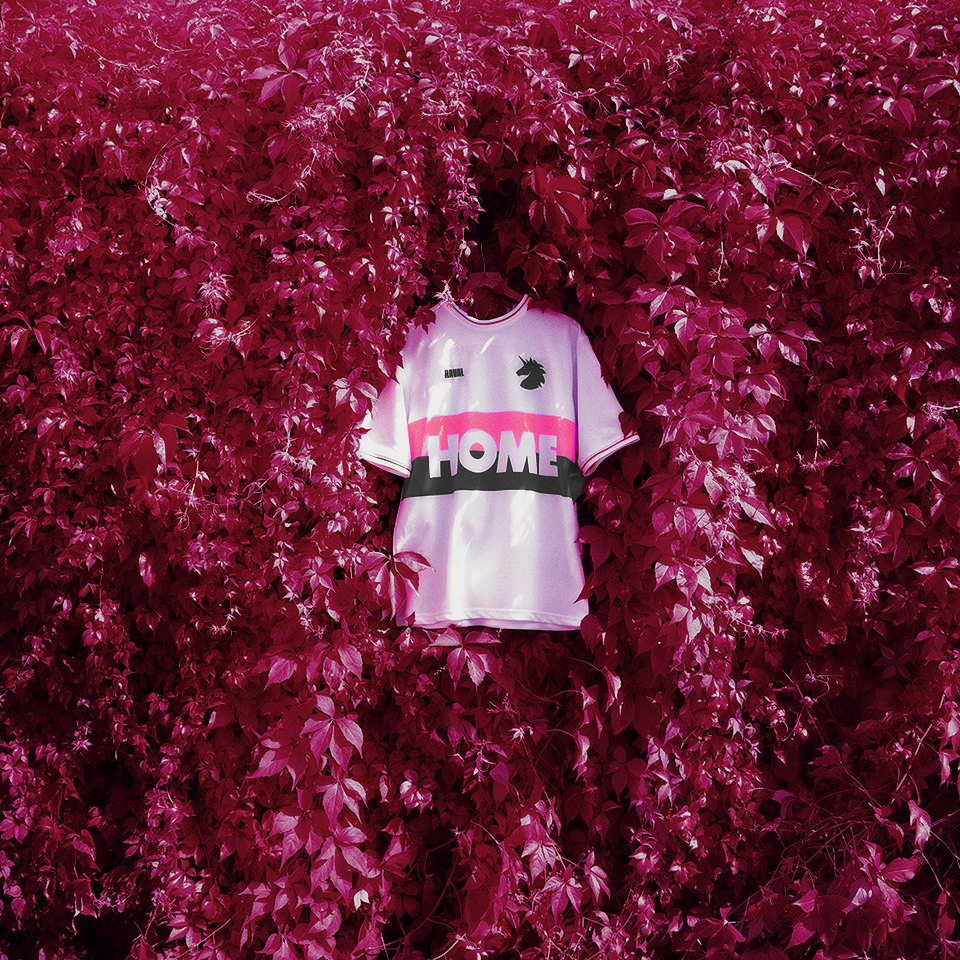
The new white shirts feature medieval numbers and rainbow hearts, a design that felt like it could only ever have been ours. But what struck me most was watching some of the newer players pull them on for the first time. Seeing that same goofy, beaming look on their faces, the one I recognised from years ago in the changing rooms, told me everything. The shirts were new. The feeling was exactly the same. Who knows what moments we’ll create in them.
Look like a team, play like a team
If you run a football team, here is what I want to say to you: get yourself a proper kit.
Not because it will make you play better, though it might. Not because it looks good in photos, though it will. But because the process of making one, choosing your colours, arguing over the badge, seeing it arrive in a box and handing it to your teammates, is one of the most quietly powerful things a group of people can do together.
It turns a bunch of individuals into something with a name, a look, and a story. And that, in amateur football, is everything.
Images by Ryu Voelkel / @toksuede.
Andrew Weber is the founder of Indie Football, a Berlin-based DIY space for football teams that helps craft their brand, visual identity and purpose. The studio is currently offering a pay-what-you-can package, with club crest, kit design and usage guidance included. Visit Indie Football to find out more.